Furniture Gallery
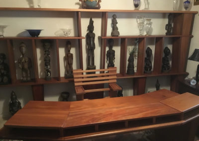
Office Suite
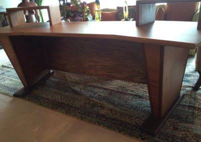
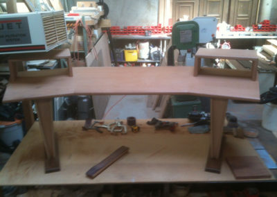
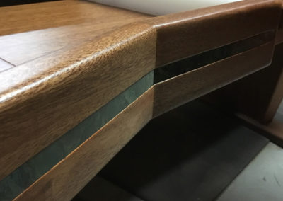
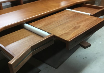
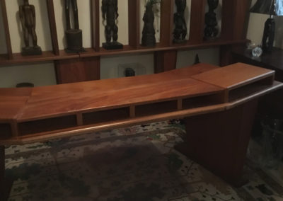
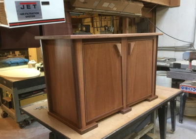
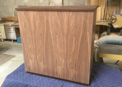
Constructed of African Mahogany trimmed with Balau this table was to be a mixing table for a recording studio.The plywood rear panel was requested by the client due to the weight of the compnents it was intended to support. Unfortunately rather than using African mahogany plywood he preferred to use oak with a stain.
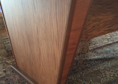
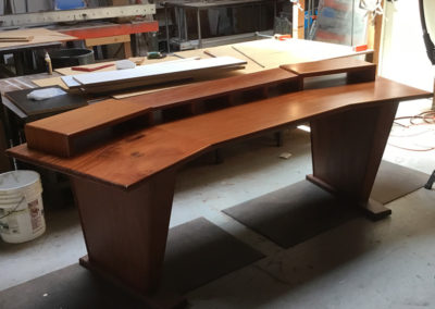
…but the studio project was terminated. The client wanted to keep the table, nevertheless and asked if it could be converted to a desk. The first thing to go was the rear panel and fortunately I was allowed to replace the oak on the sides of the legs with African Mahogany.
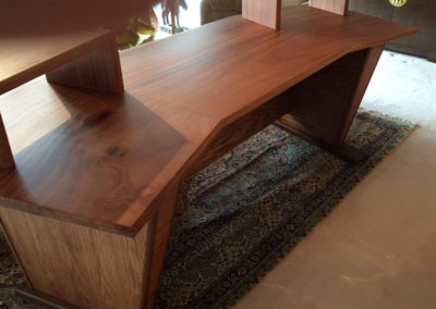
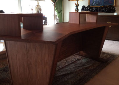
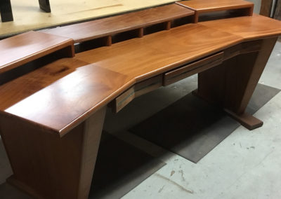
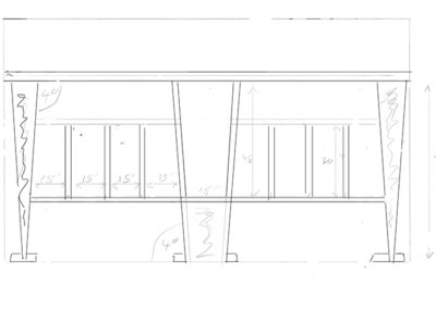
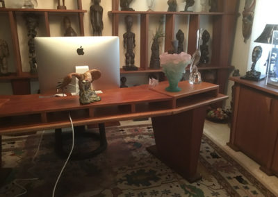
Next the high shelves were cut down and a middle one was added to support a monitor. The new design would provide space for paperwork to slide beneath the monitor keeping the surface of the desk free from clutter.
…and featuring a keyboard tray that pivots to provide the most comfortable position for resting the users forearms.
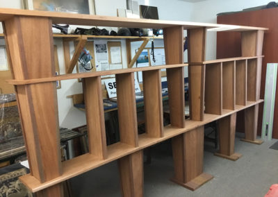
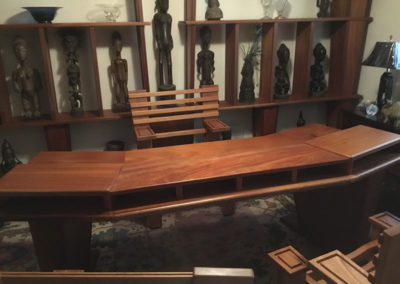
The desk was so well received that a second piece to match was requested – a bookcase that would incorporate the distinctive inverted pyramid shape of the desk.
Inverted pyramids may work fine for supporting desks but the shape might be considered somewhat less than ideal when serving as a column to support shelves! Clearly it was time to think well outside the box…
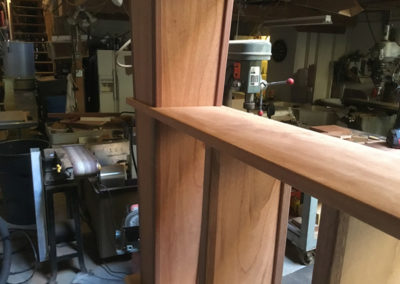
So the columns were made to go right through the middle of the shelves – but obviously that alone didn’t make them capable of supporting anything…
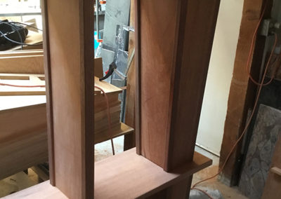
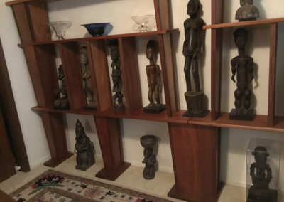
The trim however, did not pass through the shelves. Wedged between the shelves and fitted to the columns, it was the trim that did all the lifting. This design overcame one other significant obstacle as well. The entire unit was intended for a room that was down two flights of stairs and down a narrow hallway. There was no way it could arrive fully assembled…
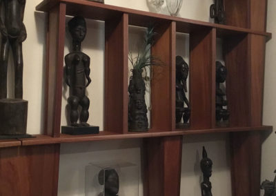
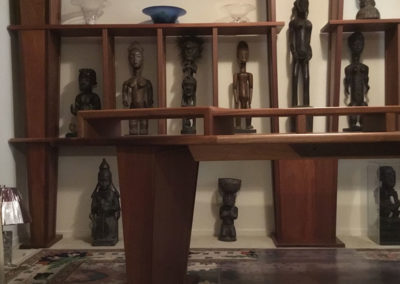
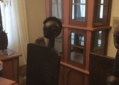
A total of 48 distinct pieces form a freestanding bookcase when assembled without nails, screws, dowels and etc. of any sort, that is rigid and stable enough to support some rather substantial pieces of African statuary and various heavy glass sculptures!
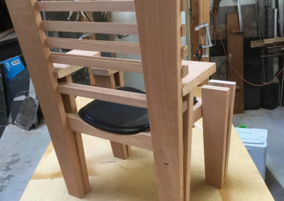
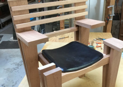
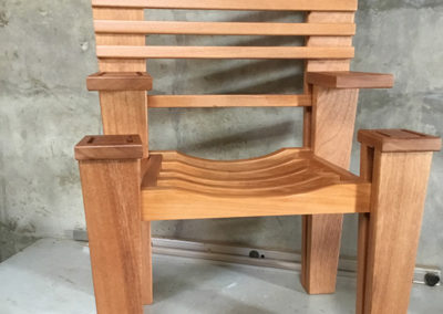
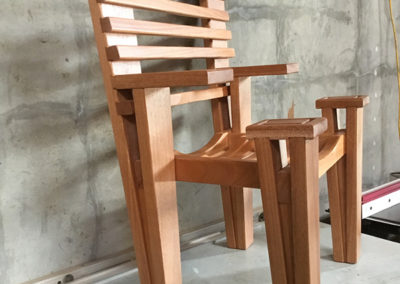
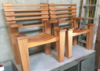
Creating chairs that looked like that desk and bookcase that were nevertheless, chairs, wasn’t going to be easy.
The contour of the seat supports were painstakingly shaped to match the seat of the clients favorite chair.
Desk chairs often have arm rests but these are rests stepped down in front to avoid interfering with the tilting keyboard tray. The rearward lean of the legs matched the angle of those on the desk.
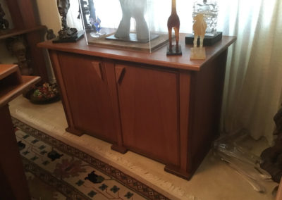
Done! …or perhaps not. That cabinet you can barely see off to the right simply won’t do. It will have to be replaced.
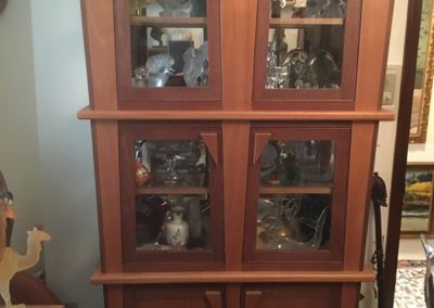
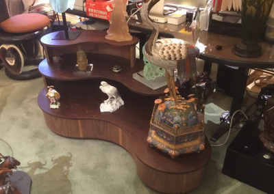
Much better – but there still never seemed to be enough room for all the sculptures. There remained no alternative but to add a display cabinet…
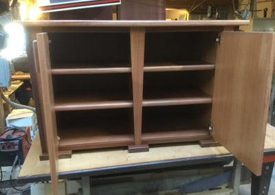
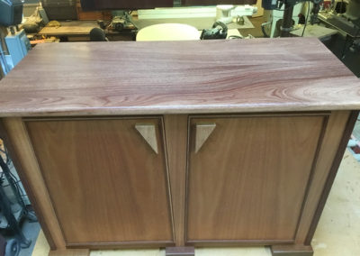
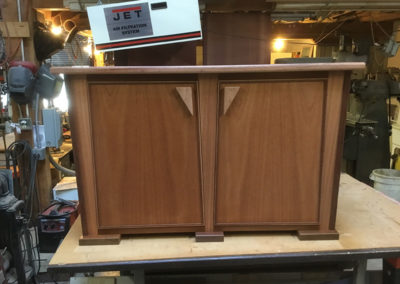
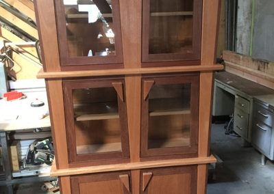
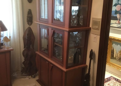
…like this one, for instance. The stiles and the shelves should remind you a lot of the bookcase – and the doors and pulls extend fromthe low cabinet. There is one substantial difference between the design of the two cabinets.
That is while the first one appears as if it is wider at the top than the bottom, it is just the shape of the stiles that creates that illusion. The display cabinet is actually wider at the top. The two degree taper adds over five inches overall.
I had to be careful when ordering the glass for the sides. Otherwise they’d have ended up a half inch short. Adding 2 degree angles to everything increases complexity exponentially!
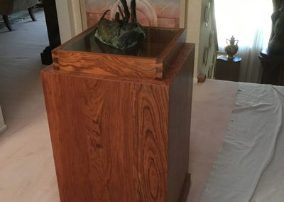
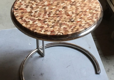
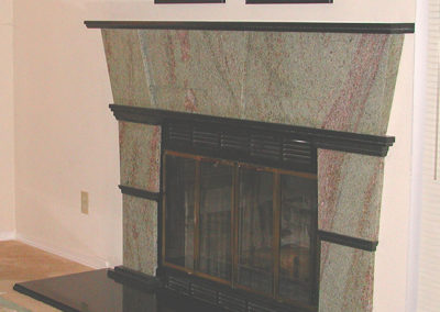
I realize it’s not a piece of furniture but it happens to be an old favorite of mine – 28 pieces all hand cut.
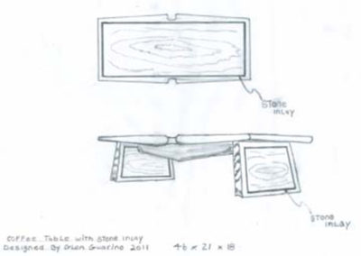
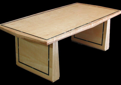
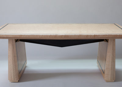
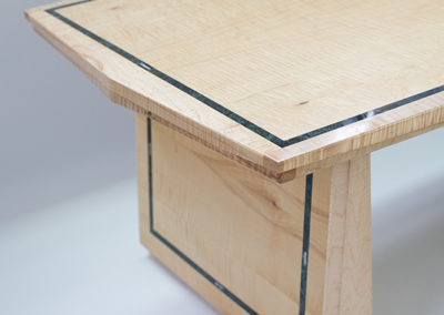
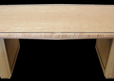
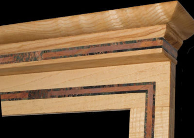
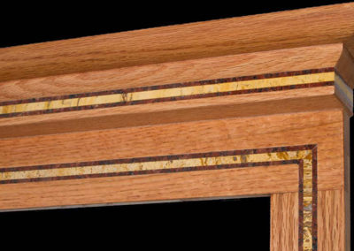
Some beautifully crafted pieces are the contibution by Guarino Furniture Designs LLC in a collaboration with Seclay.
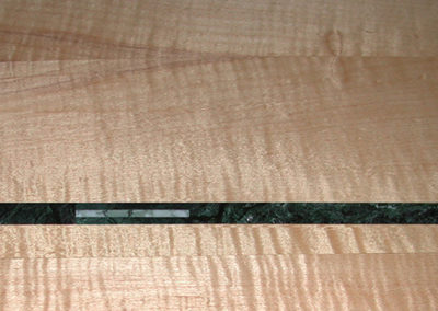
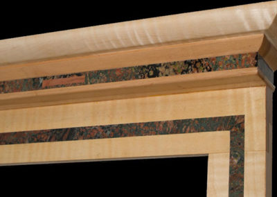
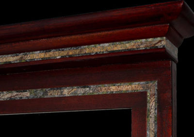
Glen Guarino created his table and mirror frames with the specific intention of highlighting the aesthetic impact resulting from the addition of PrecisionStone Inlays to his designs.

